LaTeX Plot Snippets
The LaTeX package tikz contains a set of commands that can render vector based graphs and plots. This post contains several examples which are intended to be used as a cut-and-paste boilerplate. Each sample comes with a screenshot and a snippet that contains the relevant parts of the LaTeX source code. The entire source code for each plot can be found in the appendix at the bottom of this post.
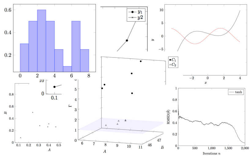
Scatter Plot
\begin{tikzpicture}

  \pgfplotsset{
      scale only axis,
  }

  \begin{axis}[
    xlabel=$A$,
    ylabel=$B$,
  ]
    \addplot[only marks, mark=x]
    coordinates{ % plot 1 data set
      (0.31,0.28)
      (0.24,0.50)
      (0.52,0.1)
      % more points...
    }; \label{plot_one}

    % plot 1 legend entry
    \addlegendimage{/pgfplots/refstyle=plot_one}
    \addlegendentry{plot 1}
  \end{axis}

\end{tikzpicture}
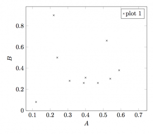
Line Chart
\begin{axis}[
  xmin=0, xmax=2000,
  ymin=0, ymax=1,
  xtick distance=500,
  xlabel=Iterations $n$,
  ylabel=$\mathrm{RMSD}(\hat{\theta})$,
]
  \addplot[] % no additional information passed to addplot
    coordinates{ % plot 1 data set
      (1,0.716)
      (2,0.6686) % ...
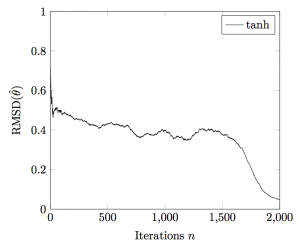
Two Y-Axes Chart
\begin{axis}[
  axis y line*=left,
  xlabel=$x$,
  ylabel=$y_1$,
]
  \addplot[mark=*]
    coordinates{
      (.1,5)
      (.2,10)
      % more points
    }; \label{plot_1_y1}

\end{axis}

\begin{axis}[
  axis y line*=right,
  axis x line=none,
  ylabel=$y_2$,
]
  \addplot[mark=x]
    coordinates{
      (0.18,0.89)
      (0.27,0.81)
      % more points
    }; \label{plot_1_y2}

  \addlegendimage{/pgfplots/refstyle=plot_1_y1}\addlegendentry{$y_1$}
  \addlegendimage{/pgfplots/refstyle=plot_1_y2}\addlegendentry{$y2$}
\end{axis}
Function Graph
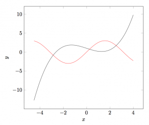
\begin{axis}[
  xlabel=$x$,
  ylabel=$y$,
  samples=100,
  ]
  \addplot[][domain=-4.5:4]{0.2*x^3-x+1};
  \addplot[draw=red][domain=-4.5:4]{3*sin(deg(x))};
\end{axis}
3D-Plot
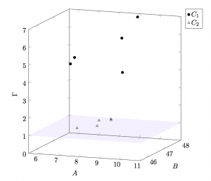
\begin{axis}[
  view={20}{10},
  legend pos=outer north east,
  xlabel=$A$,
  ylabel=$B$,
  zlabel=$\Gamma$,
  xmin=5.5, xmax=11,
  ymin=45.5, ymax=48,
  zmin=0, zmax=7,
  ]

  \addplot3[
    samples = 60,
    samples y=0,
    only marks,
    mark=*,
  ]
  coordinates {
    (7.23756,45.9033456,5)
    (8.712544,47.262364,4)
    % more data
  }; \label{c1}
Histogram
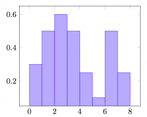
\begin{axis}[
  area style,
]
  \addplot+[ybar interval,mark=no] plot coordinates {
    (0,.3)
    % more data
  };
\end{axis}
Further reading: Plenty of tikz examples can be found at http://www.texample.net/tikz/examples/
Appendix
Below is the full source code used to generate the individual figures.
% simple scatter plot

\documentclass[11pt]{article}

% graphics
\usepackage{tikz}
\usepackage{pgfplots}
\pgfplotsset{width=7.5cm,compat=1.12}
\usepgfplotslibrary{fillbetween}


\begin{document}

\begin{tikzpicture}

  \pgfplotsset{
      scale only axis,
  }

  \begin{axis}[
    xlabel=$A$,
    ylabel=$B$,
  ]
    \addplot[only marks, mark=x]
    coordinates{ % plot 1 data set
      (0.31,0.28)
      (0.24,0.50)
      (0.52,0.1)
      % more points...
    }; \label{plot_one}

    % plot 1 legend entry
    \addlegendimage{/pgfplots/refstyle=plot_one}
    \addlegendentry{plot 1}
  \end{axis}

\end{tikzpicture}

\end{document}
% line chart

\documentclass[11pt]{article}

% graphics
\usepackage{tikz}
\usepackage{pgfplots}
\pgfplotsset{width=7.5cm,compat=1.12}
\usepgfplotslibrary{fillbetween}


\begin{document}

\begin{tikzpicture}

  \pgfplotsset{
      scale only axis,
  }

  \begin{axis}[
    xmin=0, xmax=2000,
    ymin=0, ymax=1,
    xtick distance=500,
    xlabel=Iterations $n$,
    ylabel=$\mathrm{RMSD}(\hat{\theta})$,
  ]
    \addplot[] % no additional information passed to addplot
    coordinates{ % plot 1 data set
      (10,0.28)
      (200,0.50)
      (900,0.1)
      (1800,0.8)
      % more points...
    }; \label{plot_one}

    % plot 1 legend entry
    \addlegendimage{/pgfplots/refstyle=plot_one}
    \addlegendentry{tanh}
  \end{axis}

\end{tikzpicture}

\end{document}
% chart with two y axes

\documentclass[11pt]{article}

% graphics
\usepackage{tikz}
\usepackage{pgfplots}
\pgfplotsset{width=7.5cm,compat=1.12}
\usepgfplotslibrary{fillbetween}


\begin{document}

\begin{tikzpicture}

  \pgfplotsset{
      scale only axis,
  }

  \begin{axis}[
    axis y line*=left,
    xlabel=$x$,
    ylabel=$y_1$,
  ]
    \addplot[mark=*]
      coordinates{
        (0.07310,1.44255)
        (0.18587,2.54389)
        (0.22764,1.65875)
        (0.44484,0.76010)
        (0.63280,0.51687)
        (0.92936,0.23310)
        (1.02960,3.24661)
        % more points
      }; \label{plot_1_y1}

    \end{axis}

    \begin{axis}[
      axis y line*=right,
      axis x line=none,
      ylabel=$y_2$,
    ]

    \addplot[mark=x]
      coordinates{
        (0.06892,0.95942)
        (0.16916,0.95942)
        (0.34042,0.92901)
        (0.58267,0.80740)
        (0.82911,0.48984)
        (0.94606,0.21283)
        % more points
      }; \label{plot_1_y2}

    \addlegendimage{/pgfplots/refstyle=plot_1_y1}\addlegendentry{$y_1$}
    \addlegendimage{/pgfplots/refstyle=plot_1_y2}\addlegendentry{$y2$}
  \end{axis}

\end{tikzpicture}

\end{document}
% function graph

\documentclass[11pt]{article}

% graphics
\usepackage{tikz}
\usepackage{pgfplots}
\pgfplotsset{compat=1.12}
\usepgfplotslibrary{fillbetween}


\begin{document}
  \begin{tikzpicture}

    \pgfplotsset{
      scale only axis,
    }

    \begin{axis}[
      xlabel=$x$,
      ylabel=$y$,
      samples=100,
      ]
      \addplot[][domain=-4.5:4]{0.2*x^3-x+1};
      \addplot[draw=red][domain=-4.5:4]{3*sin(deg(x))};
    \end{axis}

  \end{tikzpicture}

\end{document}
% 3d plot

\documentclass[11pt]{article}

% graphics
\usepackage{tikz}
\usepackage{pgfplots}
\pgfplotsset{compat=1.12}
\usepgfplotslibrary{fillbetween}


\begin{document}
  \begin{tikzpicture}
    \begin{axis}[
      view={20}{10},
      legend pos=outer north east,
      height=10cm,
      width=10cm,
      xlabel=$A$,
      ylabel=$B$,
      zlabel=$Gamma$,
      xmin=5.5, xmax=11,
      ymin=45.5, ymax=48,
      zmin=0, zmax=7,
      ]

      \addplot3[
        samples = 60,
        samples y=0,
        only marks,
        mark=*,
      ]
      \coordinates {
        (7.23756,45.9033456,5)
        (8.712544,47.262364,4)
        (9.164456,47.625645,7)
        (6.864465,46.623465,5)
        (8.775555,47.143243,6)
      }; label{c1}

      \addplot3[
        samples = 60,
        samples y=0,
        only marks,
        mark=triangle,
      ]
      \coordinates {
        (7.6623466,47.8684567,1)
        (7.7534556,47.7535345,1)
        (7.2542366,47.6423454,1)
        (7.6524454,47.0284520,1)
        (6.9523543,46.6664323,1)
      }; label{c2}

      \addplot3[
        fill,
        color=blue,
        opacity=0.06,
      ]
      \coordinates {
        (5.5,45.5,1)
        (5.5,48,1)
        (11,48,1)
        (11,45.5,1)
      };

      \addlegendimage{/pgfplots/refstyle=c1}addlegendentry{$C_1$}
      \addlegendimage{/pgfplots/refstyle=c2}addlegendentry{$C_2$}
    \end{axis}
  \end{tikzpicture}

\end{document}
% histogram

\documentclass[11pt]{article}

% graphics
\usepackage{tikz}
\usepackage{pgfplots}
\pgfplotsset{width=7.5cm,compat=1.12}
\usepgfplotslibrary{fillbetween}


\begin{document}

    \begin{tikzpicture}
        \begin{axis}[
            area style,
            ]
        \addplot+[ybar interval,mark=no] plot coordinates {
            (0,.3)
            (1,.5)
            (2,.6)
            (3,.5)
            (4,.25)
            (5,.1)
            (6,.5)
            (7,.25)
            (8,.1)
        };
        \end{axis}
    \end{tikzpicture}

\end{document}